[56k no]
Added at 8:57pm, 13/05/2025.
This page is pretty image-heavy! If you're reading this using mobile data, a dial-up connection, or carrier pigeon... consider yourself warned.
Table of Contents
Hastily added at roughly 7:40pm, 13/05/2025.
I'm going to add my most recent additions to the top of the page, so this one might get a bit long. With that in mind, I'll add links to different anchor points for each individual post.
One Button Challenge Week!
Added at 09:23pm, 06/10/2025. Current edit; 05:13pm, 16/10/2025.
- The Challenge!
- Exploration & Research!
- Five Games, Five Days, One Button!
- Day One - Frograpple!
- Day Two - Gyrofighter!
- Day Three - Solarslip!
- Day Four - Magnochasm!
- Day Five - Bomberbird!
The Challenge!
A neat thing I’ve been giving some level of thought to is how limitations can breed creativity; like my Card Clash project, which I honestly still think was really fun to mess around with and explore. When it comes to designing video games around such things, though, there’s a myriad of different limitations you can potentially work with - though a lot of them tend to be purely technological, and it’s a little difficult to impress your average player by telling them you’ve managed to stuff everything into just a handful of kilobytes (as undoubtedly impressive as that is.)
Did you know the Neutral Zone (that big mess of pixels in the centre) in Atari’s Yars’ Revenge is essentially the game’s source code thrown up in visual form? That always felt like a hugely creative solution to the limitations of the VCS, honestly… at least, in my opinion. (Fun fact; Atari were worried that it’d be a huge copyright concern at the time. It’s overlaid over itself in such a way as to be pretty much unreadable, though.)
So, what about inputs? I’ve always had a bit of a fascination with interesting inputs for video games and the like, but if you were to strip it back as much as possible, I reckon the theoretical minimum level of input (while still being a video game, I suppose) would probably be a single button. Hence, a one-button challenge!
Design five games in five days that use only a single button as their input method.
Seems like a fun brief, right?
Exploration & Research!
I guess the first point is… why? I reckon the biggest advantage of a single-button control scheme is probably the fact that it lays all the cards on the table. With a single button, the player only has one option of how they might be able to interact with the game - that means that when pressing it, they’ll see every action they can possibly perform, all at the same time.
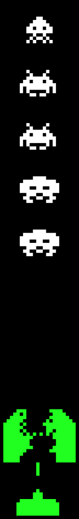
A game with two distinct forms of input. You might recognise this one.
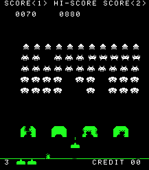
If we look at Taito’s Space Invaders as an example - someone entirely new to video games with zero prior experience might need a moment to realise that the two forms of input (a 1D axis in the form of a spinner, and a binary input with a button) would need to be used simultaneously in order to avoid a loss state. They might not realise that the ability to move your ship and the ability to fire from your ship are intertwined as a core part of the game’s design, because the crutch of “universal understanding” simply wouldn’t apply to them.
…it is kind of weird, when you think about it, how easily a lot of us have developed the intuitive understanding that using two entirely different and abstract forms of input will have a universally understood effect. I think Mooncat (in Mossmouth’s UFO 50 collection) is a really fun example of messing with those expectations that I should totally write something up on, one of these days. (Let's put a pin in that for now.)
A one-button game. You might also recognise this one.
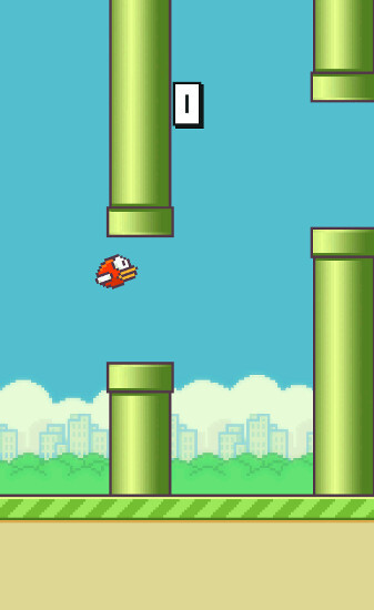
Anyway, comparatively, Dong Nyugen’s Flappy Bird doesn’t run into this issue. When you tap the screen (for all intents and purposes, pressing a button), the bird will flap a given amount of distance upward - this means that literally anyone engaging with the game will immediately understand how they can control the bird, and from that point, the game’s physics present the core challenge. The entire extent of the game’s instructions is the word “tap” - almost anyone can understand that!
So, one-button games are probably the biggest pendulum swing toward simplicity and away from “where’s the L3 button?” out there, but that also comes with a notable drawback; variation.
Doesn't this look tedious? It's basically just a standoff...
Again, looking at Space Invaders, the variation of the game comes about by being able to position yourself and then fire at an enemy. If we were to make “one-dimensional Space Invaders”, there’d essentially be no challenge - it’d simply be a matter of you firing at the invaders before they fire at you. That’s because the game is fundamentally designed around the concept of being in two dimensions, even though you only move in one - that element of positioning is an additional layer of complexity atop being able to fire, but it’s necessary to make the game fun.
In theory, you could maybe make the game more appealing by being able to have the invaders move while you stay still... I'll get into that later.

Surprisingly complex for a simple game, huh? (Courtesy of this really interesting Wordpress post about Flappy Bird's physics, and why they feel "harder" than other, similar games. Worth a read!)
But looking back at Flappy Bird - the game is designed around the limitations of its input methods. I mentioned the physics presenting the core challenge, but that’s the whole point - your entire extent of interaction with the game boils down to being able to make your bird flap, but the game’s physics - with the bird constantly being pulled downward by gravity - and inherent challenges - like the pipes that you have to thread the needle through - present the actual appeal of the gameplay. This isn’t a situation like our “one-dimensional Space Invaders” where simplifying the game removes the fun - the game’s variation comes less from your inputs, and more from the game itself.
With that in mind… a quick workshop of what we can do with this nifty little input!
Infinite possibilities, one might say. I mean, sure, it’s only really two (pressed/depressed), but… still.
Buttons have a binary state - on, or off. While that might seem limiting at a glance, we don’t necessarily have to treat a button like a switch - there’s a few different input elements we can consider in terms of making this little button more fun.
SNK’s The King of Fighters R-2, an example of a fighting game with tap/hold controls.
The amount of time that a button’s pressed can help us indicate some other things too, which is generally thought of in the “tap/hold” context. For example, SNK’s fighting games typically used four-button controls with light and heavy attacks using one’s arms or legs - so, “light punch”, “heavy punch”, “light kick”, and “heavy kick”. However, when developing for their handheld, the Neo Geo Pocket, they were suddenly limited to only two buttons. The fix? Tap either the punch or kick button for its light variant, and hold it for the heavy variant - characters still maintain access to their various moves from the arcade titles, all on half the number of buttons!
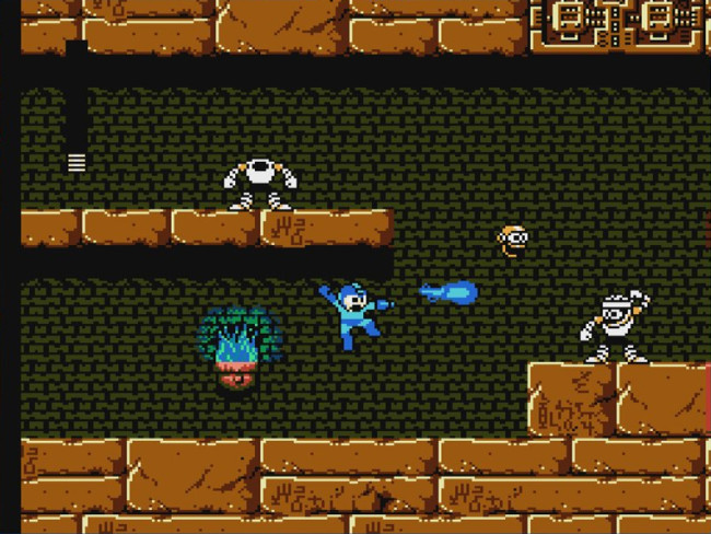
Capcom’s Mega Man 4 introduced the Charge Shot to the series, though it was pretty unbalanced in this game.
Obviously, tap/hold inputs can be used for all manner of things on top of this, such as charging an attack up - which actually brings about an interesting layer of strategy, given that you’re unable to use the button for its normal function while holding it to charge. That's a small element, but in a game with only a single method of input, that's a pretty big deal!
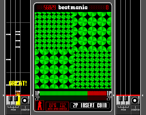
Konami’s Beatmania, an example of a rhythm game. I’m more focused on the buttons than the turntable, in this case. Maybe the novel input here could be a part of a future write-up of some kind... I've always been a sucker for weird input methods, heh.
Comparatively, the timing in which buttons are pressed can also be a consideration. In its most literal form, such as a rhythm game, you’re rewarded for inputting at the right time - Beatmania might feature five buttons and a turntable, but the same principle applies, and could quite easily be simplified down to a single button. Timing doesn’t always need to be rhythm-based, of course - it’s quite a common form of challenge that’ll appear in these sorts of things.
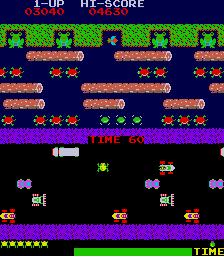
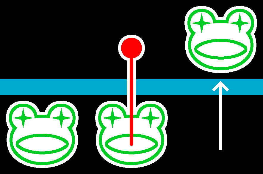
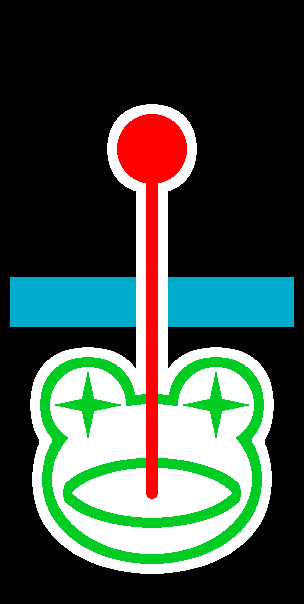
Konami’s Frogger, which isn't a one-button game, but does have elements of timing at play.
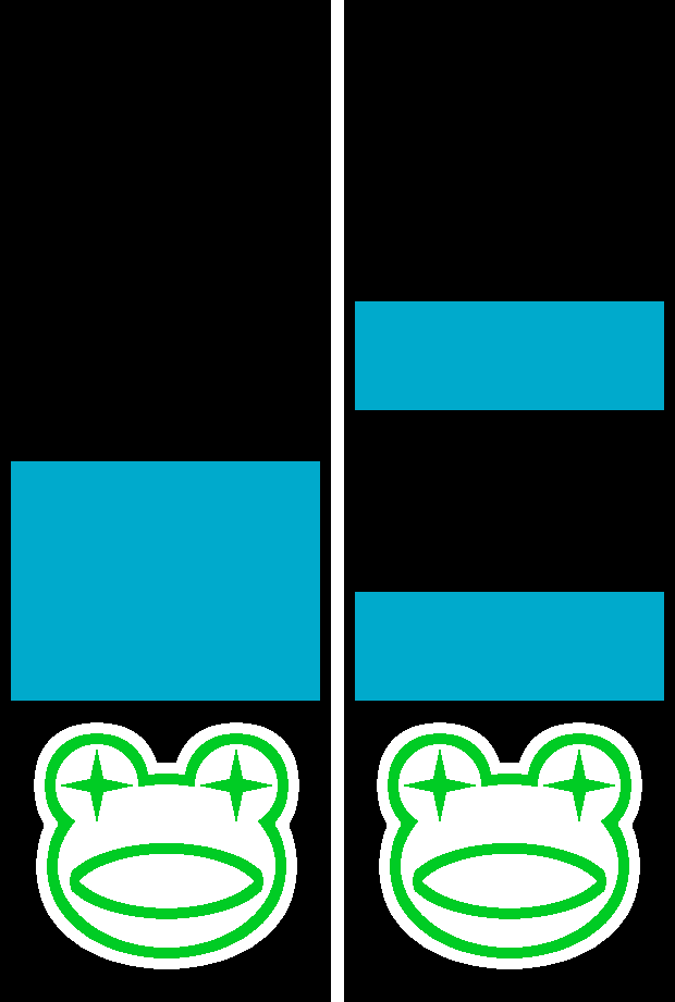
As an example, if we look at Frogger, there's an interesting element in terms of timing - despite the game not centring by any means around rhythm. If you're travelling upward in a straight line, you'll only want to step onto the road when it's unobstructed by an obstacle, or when you're not at risk of being run over - likewise, if trying to get across the river, you'll only want to step forward onto a log if it's there, because you'll lose a life otherwise. This makes the timing of when exactly you press the button a core source of the gameplay; if we were to make this game "one-dimensional" in a similar manner to the earlier example of "one-dimensional Space Invaders", the game would still work, because that element of timing is a pretty big part of the game's core appeal.
Obviously, my plan to design different one-button games isn't going to just be trying to remove input methods from pre-existing games, but I think it is worth looking at some of these games through that kind of lens to work out what could and couldn't work as a basis. And, well, it turns out that a single button might not be so limiting as we think at a glance! Of course, the major point to consider here is that a lot of what a one-button control scheme can do is contingent on the game itself, and the unique function that button provides - though, the ability to choose whether to perform a single action at will (and potentially alter the timing/duration of that action) is still pretty cool.
Five Games, Five Days, One Button!
Starting from Friday, October 10th, 2025, up to Thursday, October 16th, 2025, I'll try and throw together a simple concept each day. If some come late, I'll just present two in one day as needed - sometimes, other stuff comes first. Note that these "micro-projects" aren't going to be made into actual, playable games (for now), they're more an opportunity for me to flex my design muscles and potentially throw together some really rough visuals and the like - but who knows, I might end up making one or two of these!
Day One - Frograpple!
I mentioned Frogger earlier, and, well, frogs do lend pretty well to video games - with a handful of inherently recognisable elements that function pretty well as the basis behind a video game mechanic. However, rather than exploring the ability to jump, I’ll instead give some thought to a frog’s long, sticky tongue… maybe that could be fun?
Working with a grapple of some kind works well when we mix it with the idea of timing and holding the input down. The thought in my mind is a basic concept of being able to fire your tongue further forward by “charging” it - allowing you to cover a variable amount of forward distance, and ideally travel over obstacles such as water.
A loose mockup. Your goal’s going to be to move forward - a high-score-type game where you’ll simply need to get as far forward as possible, and ideally beat your previous scores.
A simple concept - but there’s a couple of considerations that I think would add a greater degree of challenge. Firstly; I think there should be a maximum distance that your tongue can extend to, and ideally, the location it’ll extend to should be showcased with a targeting reticule of some form, creating a set limitation to keep things within the bounds of a single screen at a time, while also allowing the player to get a really obvious understanding of where they’re headed.
This basically just makes it less of a shot in the dark where you’ll end up. You might be able to get a feel for how far your tongue would cover at a time, but I think that adds difficulty just for the sake of it. Doing it with the end of the frog’s tongue in a slightly larger form is a pretty novel way of doing that!
Beyond that, you should be rewarded for constantly moving forward, which I think could be done quite well with a consistent forward scroll. This sort of system is used in puzzle games like Intelligent Systems’ Panel de Pon and a handful of other “endless runner” games, like Hipster Whale’s Crossy Road, and works well to create a continual source of tension that can be ratcheted up as you get further into a level - forcing you to move faster. Obviously, if you move forward fast enough, the vertical scroll will follow you - so we don’t end up with the downsides of autoscrolling levels that people (quite rightfully, honestly) loathe.
Puzzle games like Panel de Pon deliberately use the speed of movement as the primary source of difficulty. We obviously have more than just this to work with, but it’s a neat starting point.
Next up; there're three distinct types of platform-related obstacles that I think would work well. The first? Platforms, on the most basic level - having a defined start and end point of safety means you’ll need to correctly time the act of pulling yourself forward, lest you end up in a hazard zone and lose a life. This allows us to create another level of difficulty - smaller platforms are more difficult to pull yourself onto, after all.
Perhaps if we were to have a difficulty curve, some method of making platforms generally on the smaller side as you progress further into the level would work well for that sort of thing.
And, a second type of platform… horizontal movement, perhaps? This does bring to mind another form of timing, perhaps, in terms of attempting to attach oneself to a platform in motion - or leave a platform in motion before it exits the screen on either side. It’s something that I wouldn’t have as the major focus, but as a minor addition for the sake of flavour, it’d work well to shake things up and provide a novel challenge after getting to grips with the initial grappling system.
I suppose doing this vertically could work, but it’d be a lot more difficult. Comparatively, something akin to Frogger’s logs makes things easier for the player, and having a few of them in sequence makes for a difficult section before getting back onto dry land. Couple this with the point on platform width, and you’ve got a pretty fun obstacle. Yes, I’m reusing the image, sue me.
Lastly, the third type; temporary “crumbling” platforms. You can’t stay on these for too long, as after a predetermined amount of time, the platform will disappear - and you will lose a life if you’re still atop it. There’s two angles to this; I initially considered having every platform function like this as an alternative to the point of scrolling, but I think the second approach of this just being an occasional, visually-distinguished feature works just as well (if not better.) Again, combine this with the other elements at play, we’ve got way more complexity to work with.
The likes of Lima Sky’s Doodle Jump does a decent job at this kind of thing, with only some of its platforms being temporary, but then having the constant threat of falling to make even ordinary platforms some risky business. Obviously, we’re not going to have to worry about falling, but that obvious distinguishing factor - a different colour and a clear crack of some kind - would be ideal. Of course, it goes without saying that the length of time you can stand on one of these platforms should always be the same, to allow the player to get a feel for it.
With that in mind, we actually have quite a decent framework for a simple game with a variety of challenges right off the bat! With elements like gradually increasing difficulty and tension, a variety of different platform types, and a movement system that’s simple to understand but gives the player a degree of agency through careful timing, this feels like a great starting point for our “one-button game” concept that’s more player-led.
Day Two - Gyrofighter!
One particular type of game I’ve been playing a lot more as of recent is early arcade shooters, namely Namco’s Bosconian - and I think it might potentially be interesting to consider how a game like this would work in a one-button context. After all, that's a pretty heavy limitation - considering even the simplest of shooters tend to feature multiple forms of input.

A pretty novel approach to the shoot-em-up genre at the time, Bosconian’s got a ton of interesting concepts at play - including multidirectional scrolling, freedom of movement, and pretty unique enemies with the Base Stars. I’d say it’s probably more comparable to the likes of Atari’s Asteroids than Namco’s earlier Galaxian - really just a cool showcase of Namco constantly trying to evolve and try new things at the time!
Obviously, the main point that comes to mind is something I briefly touched on already - with one button, your primary action in a shooter’s going to be how you go about firing. However, to avoid the issue with “one-dimensional Space Invaders” I mentioned a couple of days ago, there’s a major approach I think would work well. Specifically, that’s combining some way of influencing your movement with the fire option. Really, there's no other workaround!
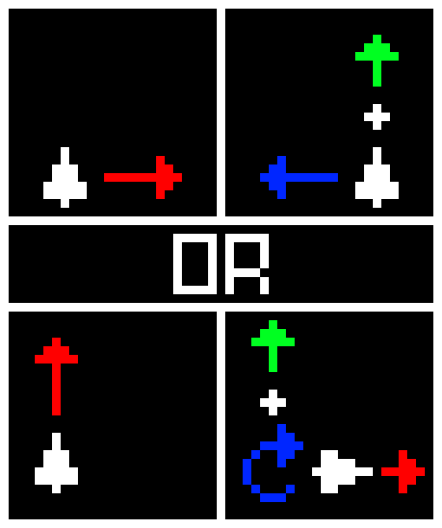
Two approaches I thought could work. The first has you move on a single axis, akin to Space Invaders - continually moving forward, but reversing your direction of movement with the action button. The second instead has you rotate 90 degrees each time, allowing for full 2D movement - obviously, positioning’s a lot more difficult here, as is evasion.
In both above cases, you’ll constantly be in motion - akin to how an infinite runner functions. Though, unlike the likes of Adam Saltsman’s Canabalt, you’re not going to use your button to jump - instead, to influence your trajectory. That sort of approach means the player needs to get a feel for their own consistent speed, as well as the speed of other obstacles - that way, they can map in their brain how they might be able to avoid those obstacles.
The idea of simultaneous input feels pretty well-suited for a one-button control scheme! Even if you’re doing two things at once, the player is still able to see the full extent of how their interaction affects the game - of course, we can add additional stuff like obstacles and targets for added depth, but there’s still a level of simplicity at play. In fact, in light of obstacles… I’ll go with the second concept. It feels like you might be able to play with some cool ideas with a style like that.

Atari’s Asteroids feels like a fun source of inspiration. Not that I’d necessarily say we should match the freedom of rotation that that game has, it’d be a nightmare - more, I think the method of moving around the screen with things like looping edges is just a lot of fun, and that’d fit well with your ability to only turn in one direction.
So, what’s the game’s goal? I’m thinking it’ll be another score-chaser - survive for as long as possible, building up your score by successfully destroying obstacles. As for what form those would take, let’s say something simple - slowly-moving enemy ships that might possess one of up to five different forms, allowing for a degree of variety at play while still keeping things understandable, and also allowing us to present a sliding scale of difficulty by introducing more difficult foes (which might take multiple hits to defeat or have enhanced movement capabilities) over time. Bear in mind, we can’t really have the player be expected to perform miracles on the evasion front, so taking it too far in one direction seems unfair.
Two enemy concepts I think would really fit. The Freighter is a big, slow-moving target that’s not too difficult to hit, constantly moving in a straight line - but at an angle offset from your 90-degree line of fire. Comparatively, the Defender is a smaller target that shares your 90-degree limitation (albeit counter-clockwise), resulting in games of chicken as you try to fire projectiles at each other.
I think throwing in these enemies helps keep things fun. Having Freighters release Defenders also encourages you to defeat those, and the idea of being engaged in a game of chicken as you try to orient yourself correctly so as to be directly facing a Defender seems like it’d be fun. A point to mention is that I don’t think “tracking” enemies would work well unless they were slower than you - if you get one close enough to you on the wrong side, you end up being sort of trapped, because any action other than moving directly forward would result in your death.
Besides, the predominant challenge ought to come from that element of positioning and evasion with your limited controls, rather than careful aiming and timing - the latter would probably be a bigger consideration with the “one-axis” concept than the two-axis concept that this game goes with. Though, I think this is another pretty novel approach to the whole one-button controls concept... even if it's combining two functions into a single input!
Day Three - Solarslip!
I’ve taken two approaches now - those being to combine two functions into one action, and to be able to alter the action through the use of timing. Truthfully, I’d like to do something a little novel this time around - a little more input-centric, perhaps.
A concept present in some fighting games, albeit originating from electronic engineering, is “negative edge”. In effect, it switches the functionality of your button (s) to only take effect when releasing it - that is, instead of activating when the input changes from a 0 to a 1, it instead activates when the input changes from a 1 to a 0. While this concept is present as an element of input leniency in most modern fighting games, it’s also specifically used to describe certain moves that only come out when you release the attack button (and that’s my focus, here.)
As an example, Balrog’s Turn Around Punch (TAP) is performed by holding down all three of your punch or kick buttons (which, itself, is because Balrog doesn’t have any kicks - he’s a boxer, after all.) The longer your buttons are held down, the more powerful his TAP becomes - though, while charging it, he doesn’t have access to half his buttons… which creates an interesting strategic element - do you keep charging up the increasingly strong attack in your arsenal at the cost of half your moveset, or release it to give you more options but less power?
This actually strikes me as quite interesting, because the sense of conflict between whether to keep charging a resource for enhanced power - or whether to limit yourself to a weakened version of that resource for more manoeuvrability at the cost of that power - seems like it could bring about some cool design ideas. Of course, there’s a couple of obvious points - but having already done a charging mechanic with Frograpple, this is a good spot for something unique.
So… what about exploring that element of rotational influence from Gyrofighter in a unique way?
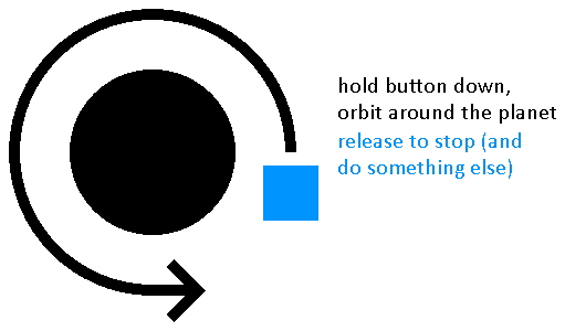
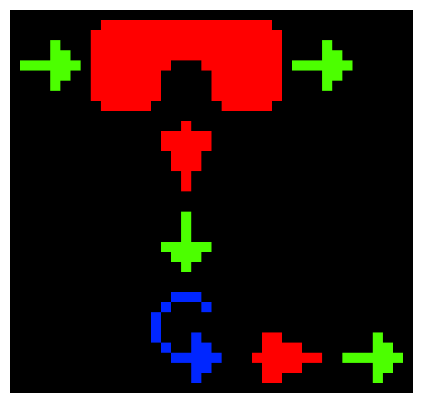
A thought I explored last time was that you can only really rotate in one direction due to the one-button control scheme, so perhaps some sort of “planetoid” that you can orbit around would lend well to this sort of thing? That way, you can gain a full range of rotation - holding the button down has you “orbit” the planetoid, then when you release the button, an action is performed while your rotation ends.
Truth be told, I thought this was pretty clever. The issue is that my initial thought of being able to fire at oncoming enemies kind of ran into an issue; firstly, it’s a little too derivative of Gyrofighter, and secondly, if an enemy is able to get down to the planetoid’s surface, it’s going to significantly impact your ability to orbit the planet. Though, a workaround could be a focus less on actually fighting foes and more so on evasion?
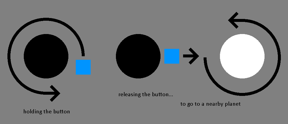
An idea for how I might go about solving this. Rather than defending a singular planetoid, you’ll transfer from one planetoid to the next - holding down the button has you “orbit”, releasing it has you “launch”.
The aforementioned element of being able to limit your ability to orbit could be fun. Taito’s Balloon Bomber has a gimmick where enemy projectiles create craters that you can’t move over, limiting your movement between the resulting hazards. So, what if approaching enemies could cause some kind of similar tension?
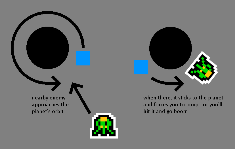
Enemies that hover around will approach your planetoid as you’re orbiting around it, so you can’t just constantly keep orbiting without moving as an eternal stalemate. When they land, you’ve basically used up all your chances - so you’ll have to fire yourself at the next planetoid in sequence!
I guess there’s also the point of how to make the game engaging, and there’s two thoughts - the first is to have it as a variation of an endless runner, and the second is to have the player reach each planetoid in a region. The latter, of course, runs into issues with enemies continuing to exist on other planetoids… unless you took the approach of UFO 50’s Warptank and had a sort of “shockwave” when you land? The idea of being able to fire yourself into an enemy to blow them up (and passing right through the explosion) feels like something fun, or maybe a bonus source of points at the very least.
Beyond that, there’s the consideration of actual aiming. I don’t honestly think full on gravity mechanics (which I’d describe as probably being most similar in concept to Rovio’s Angry Birds Space) would be a good call - the simplicity of holding the button to orbit and releasing to jettison just seems at odds with more complex space mechanics. Also, being able to just miss the side of a planetoid with a slightly off angle feels like a fun annoying situation you wouldn’t get with a gravitational field, so there’s that!
So, another space theme. But hey, space is malleable for this kind of thing, and being able to run around a tiny planet before jumping toward other ones is always nice. It’s also pretty neat that we can slot in other stuff as hazards - aliens, an ever-approaching wall of solar fire, that sort of thing. Hence, the name of the game… Solarslip!
Day Four - Magnochasm!
I was fidgeting with a magnet earlier, and I think it’s inspired me for today’s approach. Specifically; rather than your button being pressed or depressed resulting in an “on/off” or “active/inactive” effect, what if it’d instead have two effects of a pretty much equal but opposite nature? The idea behind this came from the poles of a magnet - North and South aren’t “on” or “off”, but they are still opposites.
So, this actually puts me in a decent starting spot. Assumedly, tap the button to switch your magnetic attraction. But, what kind of concept would I be able to make from that? It occurs to me that I’ve done two space-themed ideas, so maybe it’d be a good idea to do something slightly different.
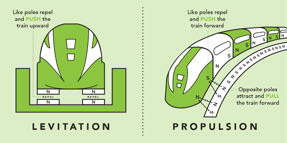
Magnetic levitation trains (or “maglevs”) work with an interesting method of propulsion. Attracting poles pull the train forward, while repelling poles push the train forward - this obviously has to be carefully timed, but it’s fantastically effective as a frictionless method of propulsion suitable for high speeds.
I’m not thinking, necessarily, of a maglev game - but the idea of being able to pull or push yourself using nearby magnetic sources (while yourself being magnetic) seems like it’d be pretty fun.
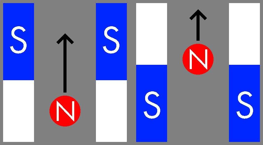
Here's a thought that comes to mind. Being able to switch your character in the centre between North or South-aligned allows you to use magnets on both sides as a method of propulsion - attracting yourself upward, or repelling yourself even further. The idea of going against gravity also feels fun... maybe this takes place in a chasm of some kind?
The concept of a chasm - hence, the name Magnochasm - lends well to a few other things. Obviously the big point is that pressing the button has your polarity change - player challenge comes from the screen slowly rising if you're not able to do the same, as well as potentially an element of you having to avoid the walls on either side. Also, the concept of your character being some kind of futuristic miner inside some giant magnetic mine works pretty well as a distinctive "setup" for narrative, right? (Almost reminds me of Namco's Dig Dug.
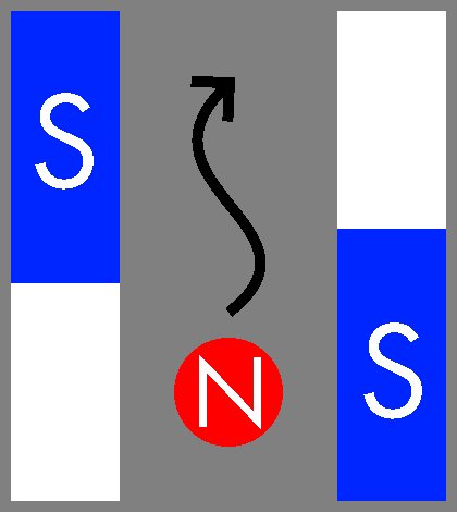
A thought on "side-to-side" movement. Being able to attract or repel yourself from one side of the chasm to the other might, at a glance, seem like a good route behind adding some obstacles - but I think the inherent challenge of movement would be more of an issue. Trying to time correct switching between polarities while bearing in mind the angles that the chasm might be at would be pretty tough. And that's not even getting into changing the shape of the chasm to a particular path...
This seems like the sort of thing that would probably be some kind of "rage game", but hey, I think that might be a lot of fun. Immediately, I can already imagine mechanics like "slingshotting" to gain significant upward momentum or the like, and maybe additional wall gimmicks like safe "bouncy" walls would lend a little bit of depth. So, yeah, Magnochasm!
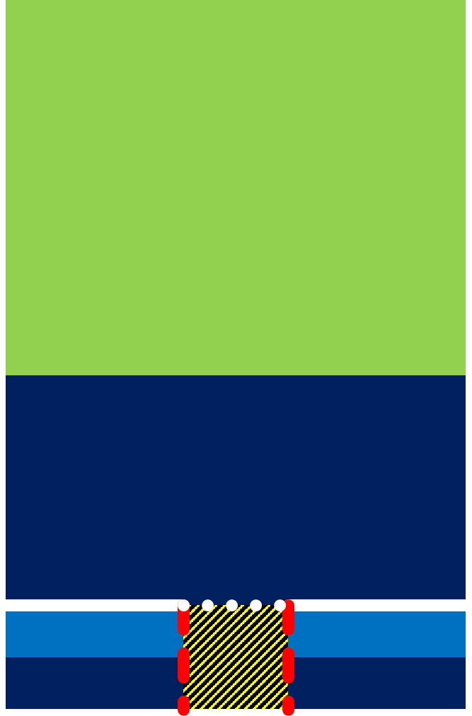
Day Five - Bomberbird!
I’ve mentioned Flappy Bird a lot. What if I were to add a little something to it for my last concept? This one’s more directly cribbing from something, but at least one project like this strikes me as fun - and an interesting concept springs to mind relating to it. It’s a little less solid, I suppose, but ech… it’s a fun one.
Atari’s Canyon Bomber has a pretty novel play on this where your balloon is constantly moving horizontally from one side of the screen to the other, and you can drop bombs in an arc - falling slightly forward based on your continual motion.
What if we were essentially to take the approach of bolting bombs onto our little bird and making them a budget Solvalou? (Namco's Xevious.)This might seem like a weird angle, but I think the inherent challenge of managing two things at once by having to avoid some kind of obstacle by managing your elevation while also having to use your bombs at the same time to take out enemies could lend to a fun idea.
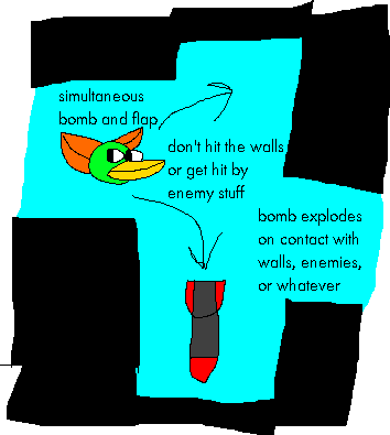
A neat side effect of this is that your positioning actually influences whether or not it’s a good time to either flap or drop a bomb. You don’t want to be too high, or dropping a bomb would make you hit the ceiling - being low lets you drop a lot of bombs, but raises your elevation in the process. Maybe there’s some emergent strategy there?
Throw in some “bases” as stationary targets and a couple of launching rockets akin to Konami’s Gradius, and you’re pretty much golden for a fun score-chase shoot-em-up that works under the single button constraints. And, in keeping with portmanteau titles and even a little bit of alliteration, let’s call this one Bomberbird. Simple, understandable, far less messing about than some of the older ones... but a pretty natural expansion of the old formula!
Quick Note & Update!
Added at 11:11am, 28/09/2025.
Mainly just putting this here for the sake of transparency; I've not been able to get access to the Internet for most of the summer, hence some level of scarcity in additions to this blog. Thankfully, that's sorted now; hopefully I'll be able to balance this alongside other stuff. While I won't link this at the top (and might do a couple of these types of explanatory posts in the future, if it's needed!), it's better to be open about it. Besides, I've got an idea in mind for a challenge...
Archive Appraisal #01!
Added at 04:19pm, 10/06/2025. Edited continually since then. Current edit; 03:03pm, 28/09/2025.
The Archive Appraisal collection will basically just be a deep-dive into different random projects I've messed about with in the past, which are by no means going to manifest as full-scale experiences, but might exist either as tech demos to try and keep myself up-to-scratch on Unreal Engine, or some concepts/one-sheets/write-ups that I've created in the past (either out of personal interest, or during my recent stint in a games design course.)
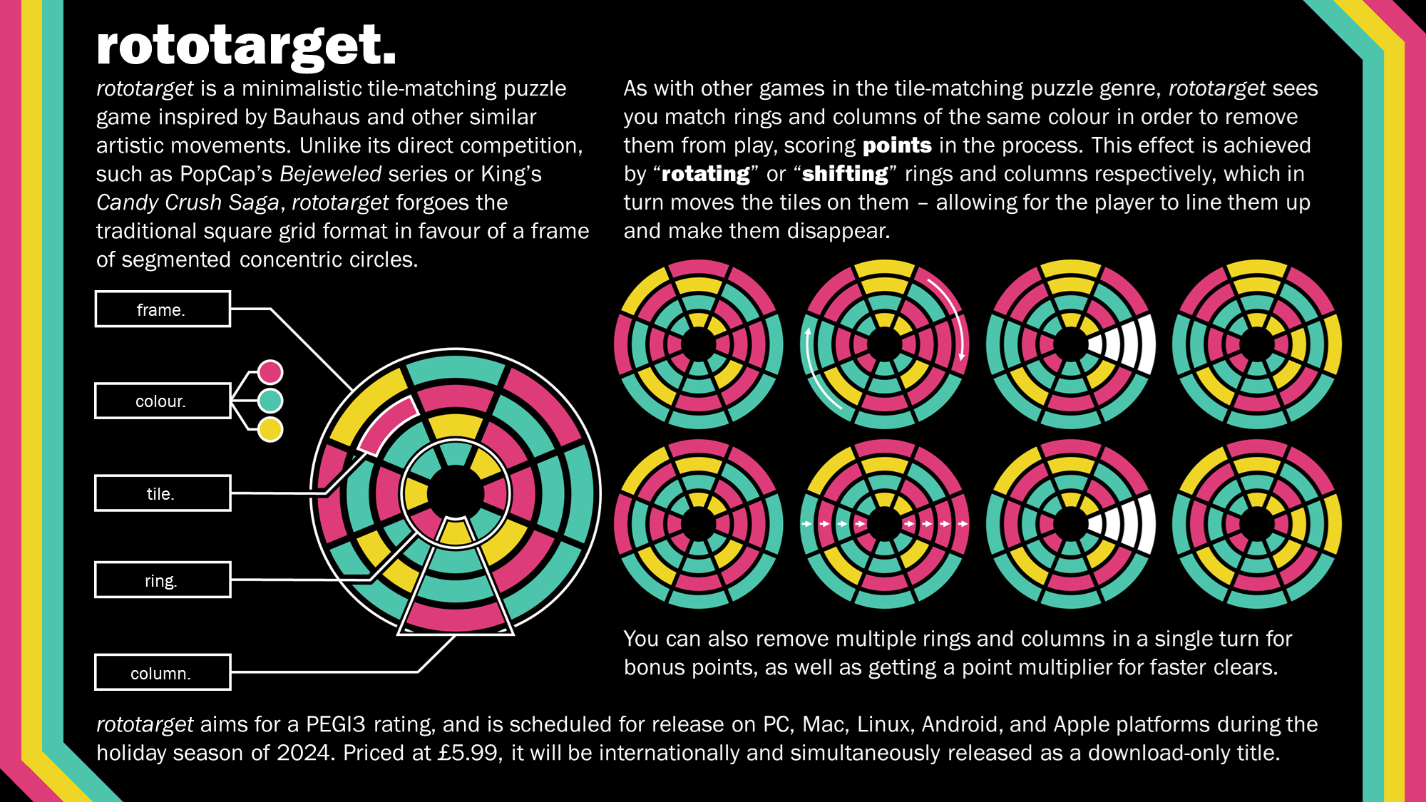
This time around, I'll explore a slightly lighter concept that I cooked up midway through my second year. Specifically, that's Rototarget, an unorthodox puzzle game with some interesting influences here and there.
One of my first... actually, semi-okay one-sheets?
The basic concept behind this was inspired by Skip Ltd.'s bit Generations series for the Game Boy Advance, which predominantly features very simple video-game concepts that provide a fresh take on fairly well-trodden genres - my focus here being Dialhex, an unusual falling-block puzzle game with triangular tiles and a rotating, hexagonal piece that allows the manipulation of tiles on the field (more akin to Puzzle League than the likes of Tetris.)
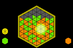
Skip Ltd.'s Dialhex (GBA, 2006). It's pretty unusual when you compare it to similar games, right?
With that in mind, Rototarget was designed to kind of play into a similar concept of an unusual field of play for a tile-matching game. I'm fairly certain things like hexes have been done before, but the concept of segmented concentric circles came about because of something else. Specifically, I felt like it'd be a lot of fun to explore how one of those more unusual fields-of-play would actually work on a mechanical level. (Otherwise, why not just keep to what people are familiar with?) Hence, the rotating / shifting concept came about - being able to spin different rows and also shifting tiles up and down along their respective columns (a thought inspired by FUTURE MEMORY's CROSSNIQ+, which has a similar focus on a normal, grid-based sense.)
I'll note; this one's not massively complex in the grand scheme of things. However, the process of working on the one-sheet was a lot of fun - I used a couple of fantastic online tools like DaltonLens' colour-blindness simulation, and ended up assembling most of this in both PowerPoint and Paint.net (mostly as a matter of familiarity.) One thing in particular I think turned out pretty good was the diagram on the left - helpfully explaining the names of different regions for the benefit of the side.
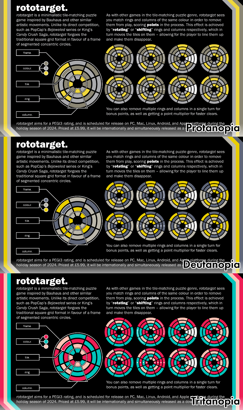
A test for three types of colour-blindness with the image, courtesy of DaltonLens' website.
In hindsight, is this great? Probably not. But, I think as an earlier stab at this kind of thing, it helps to capture a decent amount of information. Full disclosure, this is an instance of me not having actually made anything for it in a playable sense - but I do think it's the sort of thing that could be decently fun, with some minor reworks. Back when I was asking around to determine people's thoughts, a couple of people mentioned elements like making the central hole smaller, which would fit well - beyond that, additional elements from puzzle games like a "Lock" tile (preventing the rotation of that ring or the shifting of that column) would lend a lot of additional fun to the concept, and a full release would likely feature basic QoL additions like the option to select your own palettes. Perhaps, to take influence from another bit Generations game, certain palettes can be unlocked to feature different background elements... well, I can fantasise all day about such things.
Skip Ltd.'s Coloris (GBA, 2006), with a selection of a couple of styles. It's a cool touch that I'm kind of surprised other puzzle games haven't made a point of including - the likes of Tetris CD-i managed this with a genuinely striking visual style on each individual level, for instance.
Maybe I'll cover something else in a future Archive Appraisal. For the time being, hope this is a good read!
Super Ultra Hyper Card Clash II Turbo EX+ HD Remix!
Posted at around 5pm, 13/05/2025. Edited continually since then. Current edit; 11:19pm, 13/05/2025.
This post is probably a little more structured in nature. Specifically, it's about the development process behind one of my latest microprojects; Card Clash - but I'll admit, the process of development was a little bit all-over-the-place. Mainly, it was in response to an upcoming degree show you'll find me at on June 6th; given there's likely going to be professionals there, I found it vitally important to make a good impression.
One way to do that? A business card; a little memento by which people can remember you, contact you, and fill up their wallets. It's like Pokémon, but instead of monsters, you collect salarymen and freelancers. (Someone should make a game like that...) Of course, the issue with business cards is that everyone has them, so you kind of want yours to be memorable. Some people have done some pretty wild things; this guy made his business card into a functioning MIDI stylophone, for instance.

"Oh my God, it even has a USB port..."
That said; I'm not a skilled electrical engineer, nor do I want each individual business card to cost around £10, so I'd need to think of something else. Back to square one, as it were. But then, it hit me; I'm a game designer. And there's such a thing as "card games". So... what if my business cards were to constitute a component of a game in of themselves? It's not an entirely awful concept in principle; while immensely limited in some ways, I'm the sort to think that limitations can breed a lot of creativity. With that, I had a goal in mind. A possibly insane one, but a goal nonetheless.
Create a fun and memorable game limited entirely to the form factor of a business card.
So, some ground rules. Obvious thoughts that occurred to me included;
- The cards should not deviate from standard 55mm x 85mm measurements. Rounded corners are fine, but they need to fit in an average wallet.
- Each person shouldn't ever need more than one card to play. Why would anyone ever want multiple business cards from one person?
- The game should be simple, requiring minimal setup and components. That also means nothing like dice, coins, etc. - it ought to be self-contained.
- Cards shouldn't need unique printing elements, as a matter of cost. I can deviate from this a little, but something like a unique seed for each card is untenable.
- Goes without saying, but the game also needs to actually be fun. I can't stress this enough. It's going to cement people's lasting impressions of me.
That's... a lot of limitations. I still think this is doable, though. Come to think of it, that semi-sarcastic comment I made about business cards being like "adult Pokémon" could be a neat starting point; they're inherently collectable in nature. That said, making a "game" of other people's details would likely be in bad taste; so it's instead probably better to consider other ways that collectables have been gamified.
Gogo's Crazy Bones was a craze back in the 90s and again in the 2010s, with the main collectable element being the hundreds of little plastic guys you'd get in blind-bags (of whom some would be rarer than others.) These little guys were cheap to get a hold of, simple in terms of design and printing, and had a couple of cool elements relating to them; including a game based loosely on knucklebones and its deriviatives (like jacks, astragaloi, etc.) It's simple enough - you and your opponent set up two parallel lines of toys, then take turns flicking them into each other - but that simplicity was a huge appeal behind the game.
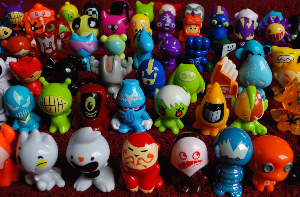
Is it just me who remembers these being really painful to flick? Or am I just a wuss...
Maybe the idea of flicking cards into one another could work? The difference is that there's a limited number of cards we can use - one per person - but this could be perhaps offset using a score counter of some kind. And, well... I'm something of a fan of fighting games (even if I'm not particularly good at them!), and the idea of my business card literally being a fighting game of some kind just seems like a lot of fun. That aside, the Gogo's influence lends really well to the idea of cards as collectables; even if people aren't going to be hunting down "special" variants, a couple of different "characters" could work well to provide variety during gameplay.
Another thought comes to mind; would it be possible to make these cards stand? I don't think a "tent" fold would work well (a big crease line down the middle of your card would be scruffy), but you could potentially make two cuts and three folds along the bottom of the card in order to create "feet" for it to stand on. This also comes with marginally less stability, which makes it slightly easier to knock the cards down, but just enough to make it possible for them to stand unassisted.
Here's a quick diagram I threw together in PowerPoint. Not measured out yet, but you'll cut along the red lines, while you fold along the white ones; consider the solid white line a "valley" fold and the dotted white like a "mountain" fold, with the two outside flaps working as the character's feet visible from the front while the inner flap works as a "back foot" for stability. Blue and green distinguish between character's torso and head. Design can of course be tweaked as needed; inspiration from LEGO minifigure printing may be smart.
This is obviously going to need some work; I'll need to test a couple of specific measurements to see which works best. Ideally, I don't want the cut/folded regions to be too large, because the rest of the card would work well for storing contact information on the back; the attached diagram is just the "front" of it, and it still needs to work as an actual business card. That said, I'm guessing a roughly 12.5mm2 "back foot" would work fineish. (Note that this section was written prior to test cuts.
That being said, there's two other things to give consideration beyond the basic concept. The first point; characters. It occurred to me while I was conceptualising this that characters are going to be a great way to get people invested in the business cards themselves - anthropomorphism is a great way to ensure that anyone thinking about throwing the card into the bin will think twice, and that could be vitally important for me. It's also important to consider the potential printing limitations I might run up against; so having each cardback consist of a simple but recognisable design would work well in this case, especially considering I can't use silhouette logic to imply their characters. Thankfully, there's a few sources I can take influence from.
- Emoticons are usually a great way to display faces in a highly minimal, but somewhat "cute" fashion. Each card having a slightly different facial expression can help imply different emotions they're experiencing, but also gives the design a more timeless quality compared to some kind of realistic print that looks like a real head squashed onto a 2D plane.
- Likewise, characters' outfits and general look consisting of solid blocks of colour should help to keep their design elegant and not too busy. This kind of stripped-back design is a great feature of modern Bomberman character designs, though I'd also point to other franchises like Super Mario for having characters that can be encapsulated in just a few colours and shapes.
A template / style-guide. Note the manic colours; each one indicates a particular area, while black isn't visible from the front.
I'm not exactly certain how many characters I'll be able to afford to print, but I'll set out with a ballpark figure of three in order to gain sufficient variety. Character theming can come from all kinds of places; I eventually settled on something of an ensemble cast unified by shared design elements (simplistic, emoticon-inspired eyes, namely), but featuring distinct elements from one another that can further imply their character - akin to how fighting games like Street Fighter imply character details through their design (Ryu's battered gi, for instance, suggests his nature as a wandering warrior.) It could also be quite fun to have each character act as a parody of other characters featured in fighting-centric media, be that in the form of fighting games, tokusatsu shows, or action movies. That aside; I'd also like to include diverse elements for the sake of making things fun. Characters shouldn't have a "gendered" appearance, and I don't think limiting skin tones to realistic ones would be logical for something like this.
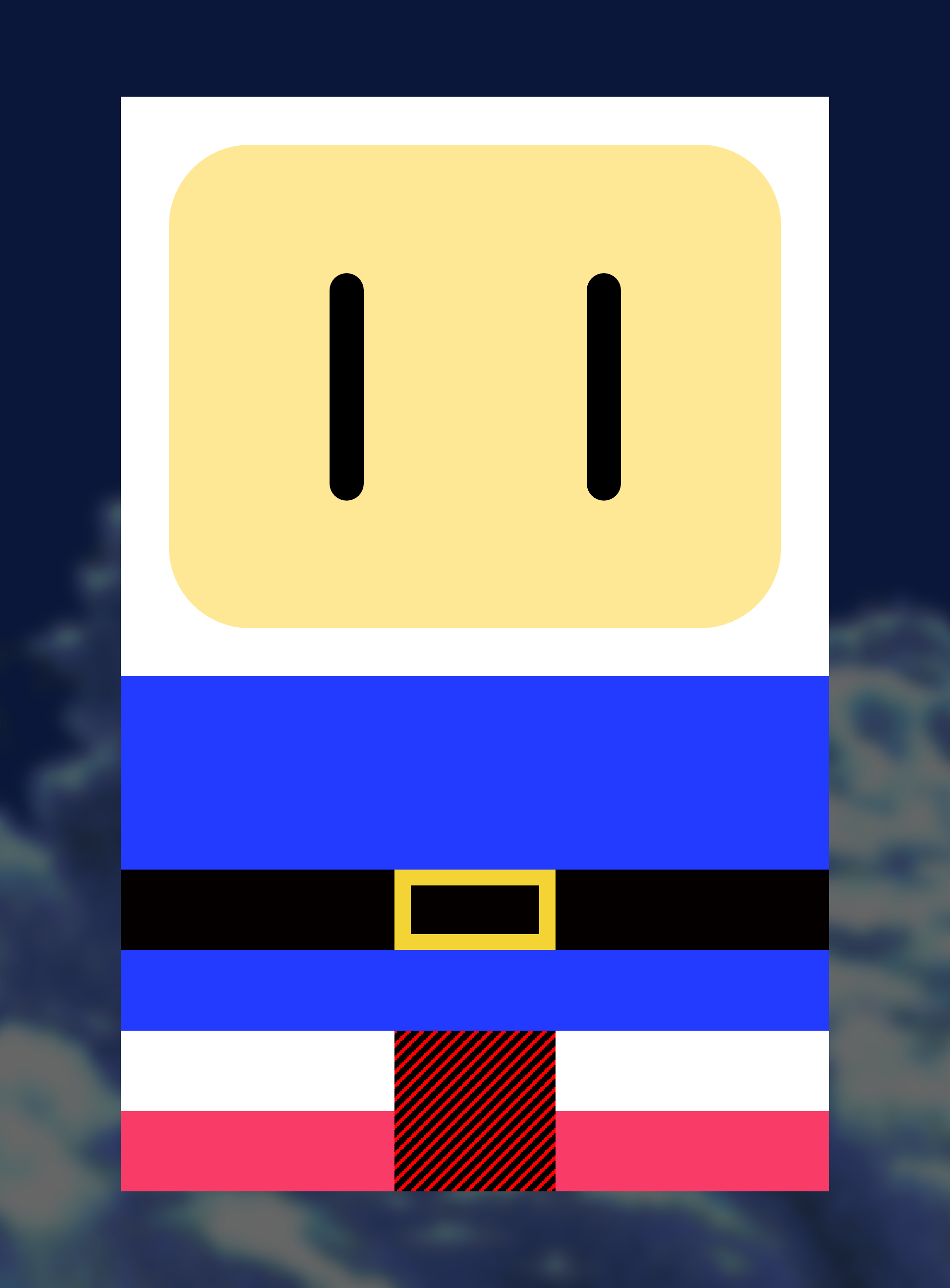
A test using Bomberman (just as an example!) Note how his distinctive blocks of colour keep him iconic and recognisable; simplistic eyes, a clear delineation between head and body, even a distinctive "character feature" in the form of his belt - a lot of fun things to include in such a small space.
My first idea was to have each character take influence from the four colours used in printing, namely cyan, magenta, yellow, and black. (The idea was that this would be a sort of self-reference to the fact that the characters are printed onto cards.) That said, I think just straight up making a "printed rangers" team would be a little dull without some kind of monster to make them unique, so characters should also each have a distinguishing element that makes them unique compared to any other.
Note for posterity; I actually considered going with pixel-based characters akin to those seen in #IDARB, but ended up deciding that might seem a little dated (pixel-art for this kind of thing had a renaissance back in the early-to-mid 2010s, but that's kind of died down since) and that simplistic character designs with vector-graphics would be a better showcase of my graphic design skillset.
Ultimately, the three characters I went with each had a distinctive design element (and inspirations from the games industry, which is a cool touch!) These ended up loosely maintaining that CYMK look, but this was only a loose style guide; the main focus was on a simplistic design. After spitballing some ideas, I came up with the following;
- Fighter. Features a martial arts gi, and is inspired by characters like Ryu from Street Fighter, Ryo Sakasaki from Art of Fighting, and Akira Yuki from Virtua Fighter. They're supposed to fit into the "wandering warrior" archetype that a lot of fighting games have, which feels kind of fitting...
- Worker. Features overalls, and is inspired loosely by the "everyman" idea present in something like Super Mario or Sokoban. I like the idea of them not really being up for this, hence the wide-eyed look.
- Hero. Features a belt-buckle and the implication of boots, being inspired loosely by hero-archetype characters from games like Dragon Quest or The Legend of Zelda. I think to offset the Fighter's more fighting-ready expression and the Worker's more shocked look, the Hero could probably look tired; perhaps from all the sidequests?
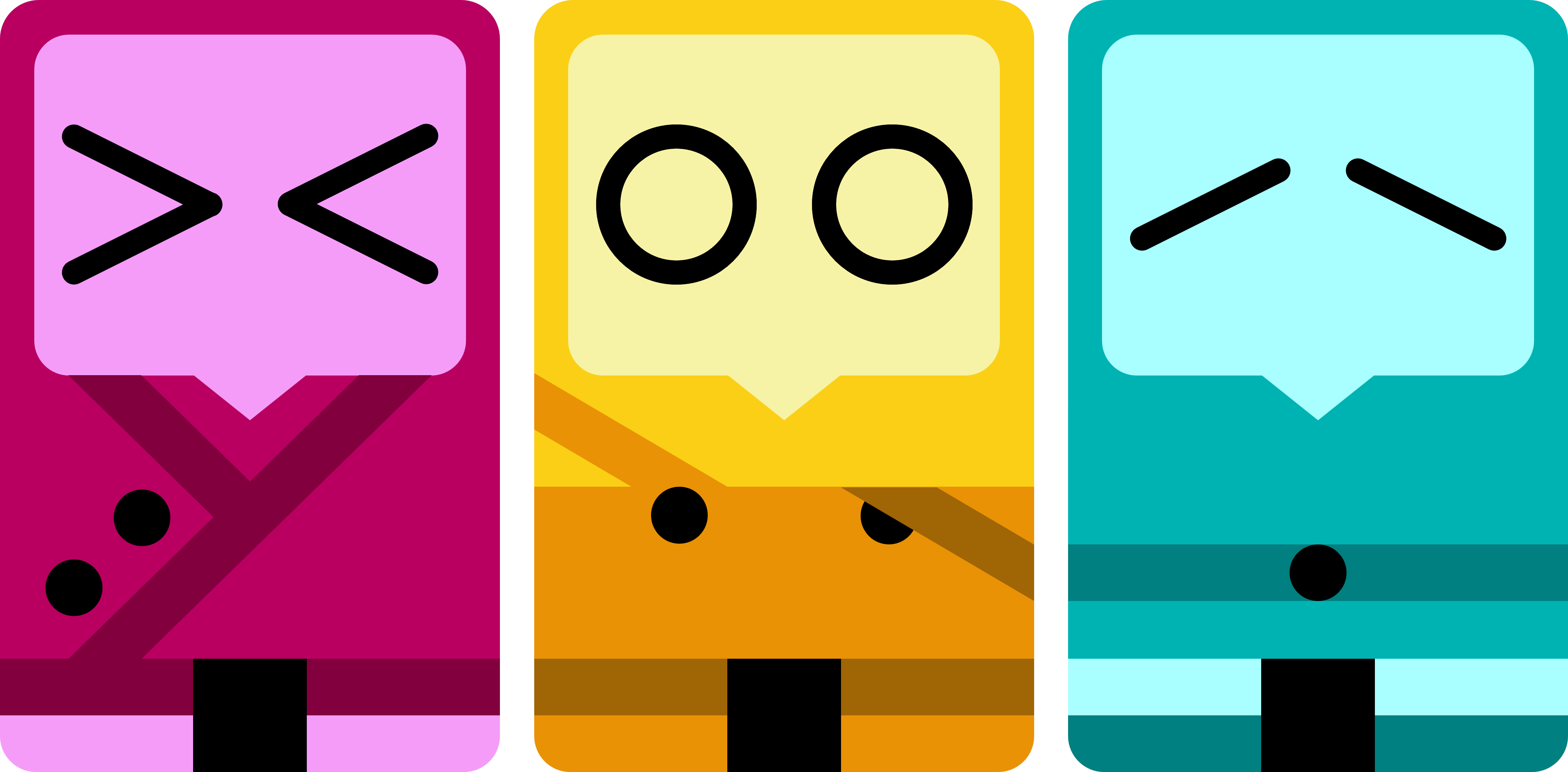
An early feature of the three! Note that the CMY look has been kept... out of order, but it's fine enough. I think their simplistic designs really help lend them some character, and I'm particularly pleased with how an element like Worker's overalls turned out. I'm thinking each business card should share a palette based on the character on the back?
A thought that occurs to me is that if each card is going to have a character, then a little blurb of some kind on the character's name, story, and maybe even likes/dislikes would be a great thing to put on the back QR code. That way, you can link to the game's rules, but also learn more about the character at the same time; helping that sense of anthropomorphisation and potentially being the tipping point that keeps these cards in someone's wallet and out of the bin. Come to think of it, Street Fighter 6 does a cool similar thing with its characters, each one getting their own little page and things like a statsheet for their likes, dislikes, height, and so forth - as well as a music track that suits them. (I'm not sure a music track would be tenable for this project, but a little stat table would be cute. Especially if every character has the same height listed as a bit of a joke.) Given it fits with genre conventions in a cute and unique way, I may as well go with it!
With that in mind, I'll need to collate some info for each character. Each one being 85mm tall would be a cute element, but basic likes and dislikes inspired by each character's inspirations would be fun; as an example, Fighter having a dislike for spiders would be a cool deep-cut reference to characters like Ryo Sakasaki, but Worker having a disdain for heavy boxes makes tons of sense given the nature of the Sokoban series.
There's another elephant in the room; rules. I can't exactly print them on the card, but that's okay; they can go onto this website somewhere, presumably linked with the QR code I'll include somewhere. (A dedicated Card Clash section would be smart.) Gogo's solves this by having your number of "failures" be directly tied to your number of active characters on the field of play, but that's not really doable with just one card. As such; I'm going to suggest that each card has a numerical health pool (let's say... 5 HP?), and this is drained should the opponent successfully flick their card into it. To add flair; the opponent deals one point of damage if the card bounces off the table at any point before hitting the card, but deals two points of damage if it manages to hit them in an airborne state (like a flying kick.) It might be fun to play around with additional ideas too - catching your opponent's card to regain a point of health could be a cool mechanic - but I'll need to playtest to determine if this is any fun.
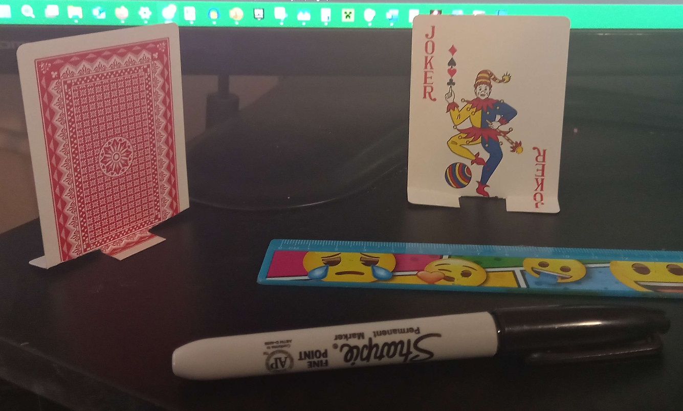
A photo of the cards I ended up using for a test! They're almost exactly the right size for this kind of thing, so that's a really neat element. In this case, the "Joker" is at the front while the back of the card is at the back; note the singular "back foot" on the back side, used for an additional little bit of stability.
I had no idea how fun this would end up being - despite my memories of playing with Gogo's, it's been years since I owned any - but it's shockingly enjoyable just to flick the cards at each other! I did some quick playtests with people I had close to hand - including my two younger siblings, who seemed to love it. (Hey, they might not be the direct target market for this particular product, but if kids find something fun, adults are sure to as well.) After trying out a couple of rulesets, some reoccuring points were;
- People seemed to like the idea of going for "trickshots", like knocking down cards from an airborne state. Seems like the addition of a little flair went down well! Numbering values for "grounded" and "aerial" takedowns seemed to work just fine, and I don't think they need much in the way of tweaking.
- Health was fairly easy to keep track of, given it only used simple numerical values and simplistic plus/minus alterations. I'm glad that simplicity paid off...
- An interesting emergent point is that the kids claimed one of the cards was "better" than the other, and they might be right; a slight folding and cutting difference between the cards generally made the black Joker a lot less sturdy than the coloured Joker. Maybe that lends to an additional element of meta-strategy?
- Catching your opponent's card was something the kids found a lot of fun at first, but quickly devolved into a bit of an argument - it seems determining where the card has passed your opponent's card was difficult for them. That aside, adult playtesters seemed to enjoy it too, so I think that's an element worth keeping; especially as it's an active comeback mechanic that doesn't rely on your enemy screwing up.
With all of that in mind, time to start work on the actual webpage element. I'll put a link to it here. Note that this isn't an official launch; I'll make a post for that once cards actually get printed. Bearing in mind I've essentially got to print three sets of cards rather than just the one, it's a little more expensive, but it'll leave an impression. That said; I also need to create the design used for the back of the cards, featuring things like my name, role, contact information, a QR code - all that jazz. That'll be fun to work out!
Minute update; done and dusted! Ended up getting these in the post on Wednesday 4th, 2025. Just in time for the upcoming event!
First post!
Posted at around 4pm, 13/05/2025.
This is more of a test than anything. I'm writing it mostly to try and feel around how to make this work; I'm still quite new to HTML, given the last time I touched it was while messing around with stuff in Notepad back in high school. But, to anyone reading this; hello from the past! (Hopefully the website's not broken, overly messy, or otherwise iffy.)
Here's some things I'd like to add from this point onward;
- Ideally, a completed home page. As of writing, it's still a bit messy, and I need to fix some things up to make it ship-shape!
- Something of a portfolio for the work I've completed thus far. That's likely to go onto my portfolio page, though I'll probably link it to Itch.
- A couple of blog posts on my other work. I've got some concepts lying around that I've not done anything with, so showing them off would be nice.
And some things I actually have added;
- An error page! It's nothing special, but it does work. Here's a link!
- A couple of neat graphic elements, including a mostly unified colour palette. That's something I do still need to fix, though.
I may as well properly introduce the site's name, by the way. "Ludohive" is a portmanteau of "ludo", as in "referring to games", and "hive", as in a beehive. That latter point might seem odd at a glance, but given my name's Bee and I live in Manchester, I think it makes some sense! My thought process is that "ludohive" is a place of play and work combined, so it feels kind of fitting. (Maybe none of this makes much sense to an outside observer, but it's the kind of thing I like to give some level of thought to.)
One more thing! This website's layout was designed by Eggramen, a really talented designer of these kinds of things. I probably wouldn't have been able to make this without editing and messing around with their template, so massive kudos goes to them for that. (It's really nice that Neocities has a community of sorts around the idea of sharing stuff like this! One of the main reasons I didn't want to just throw together a Wix site or the like.) I'll add some kind of credit button at the bottom for Ramen's stuff, but if you're looking to make your own site like this, I'd totally check out the Neocities' dedicated webmastering page for a ton of other cool layouts by cool developers. (Ramen's is a highlight because apparently it works with mobile.)